Typography
Learn about the applications of typefaces across our brand materials.
We have two primary typefaces at Azavea – New Hero and Lato. What typeface you should use depends on the output of your project.
New Hero
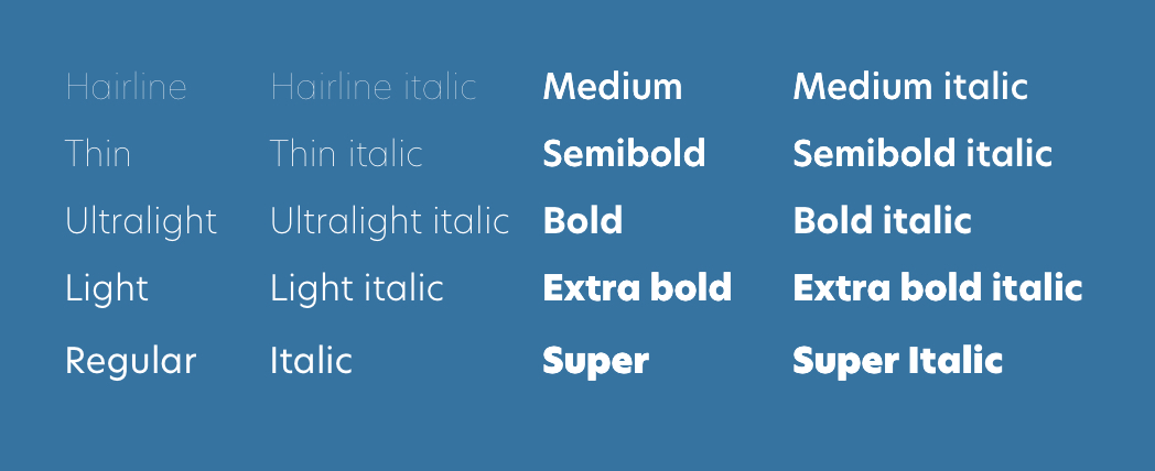
On our website, and for any hosted materials that represent the Azavea brand (including this guide), we use New Hero in its normal width. The typeface has 10 weights and was originally released by the Newlyn type foundry. It is a geometric sans-serif designed to be sturdy and impactful.
We use New Hero across our websites and branded microsites, as well in print materials such as flyers, handouts, videos, and white papers. The fonts are available through an Adobe Fonts subscription.
Lato
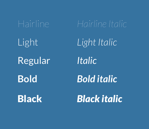
In areas where using the Adobe fonts is not possible (e.g. in proposals created in Microsoft Word or Google Slidedecks) we use Lato. Lato is a free font available on Google Fonts and is most frequently used in its normal weight. The Lato font family was released under the Open Font license in 2010 by type designer Łukasz Dziedzic with help from Google. Originally designed as a set of corporate fonts, the family uses classical proportions and are semi-rounded to give a sense of warmth.
For more detailed information about the typeface, you can refer to the About page on Lato’s Google Fonts page.